Multiple colors of grain: a color-coded packaging system for a leading grain brand
Packaging redesign for two core product lines of Uvelka, one of Russia’s leading packaged grain brands, as part of a new brand positioning and rebranding developed by BBDO Branding.
Product
Company
BBDO Branding for Uvelka
Role
Creative designer
Task
I led the redesign of two core product lines: grains in cooking bags and breakfast cereals, covering 30 SKUs in total.
Year
2017

Photo © Uvelka
About
About the company
Uvelka is one of Russia’s major packaged grain and cereal brands. The company produces cereals, flakes, and convenient grain products, and was among the early brands to introduce boil-in-bag cereals to the Russian market.
At the time of the redesign, Uvelka had a strong position in several key categories, including packaged grains, cooking-bag cereals, and quick-cooking flakes. The project focused on two of the brand’s most visible retail lines: everyday grains for lunch and dinner, and breakfast cereal flakes.
—
55.4% market share in cooking-bag grains
—
7.5% market share in cereal flakes
—
Products distributed in more than 25 countries
Team
This was a cross-functional project involving several teams.
On the client side, a neuromarketing agency developed the updated brand positioning and tested design directions with consumers. On the BBDO side, two teams worked in parallel: one focused on logo development and corporate identity, and one focused on FMCG packaging.
I led the packaging design work within the BBDO team, from the tender concept through the development of the final SKU system.
Challenge
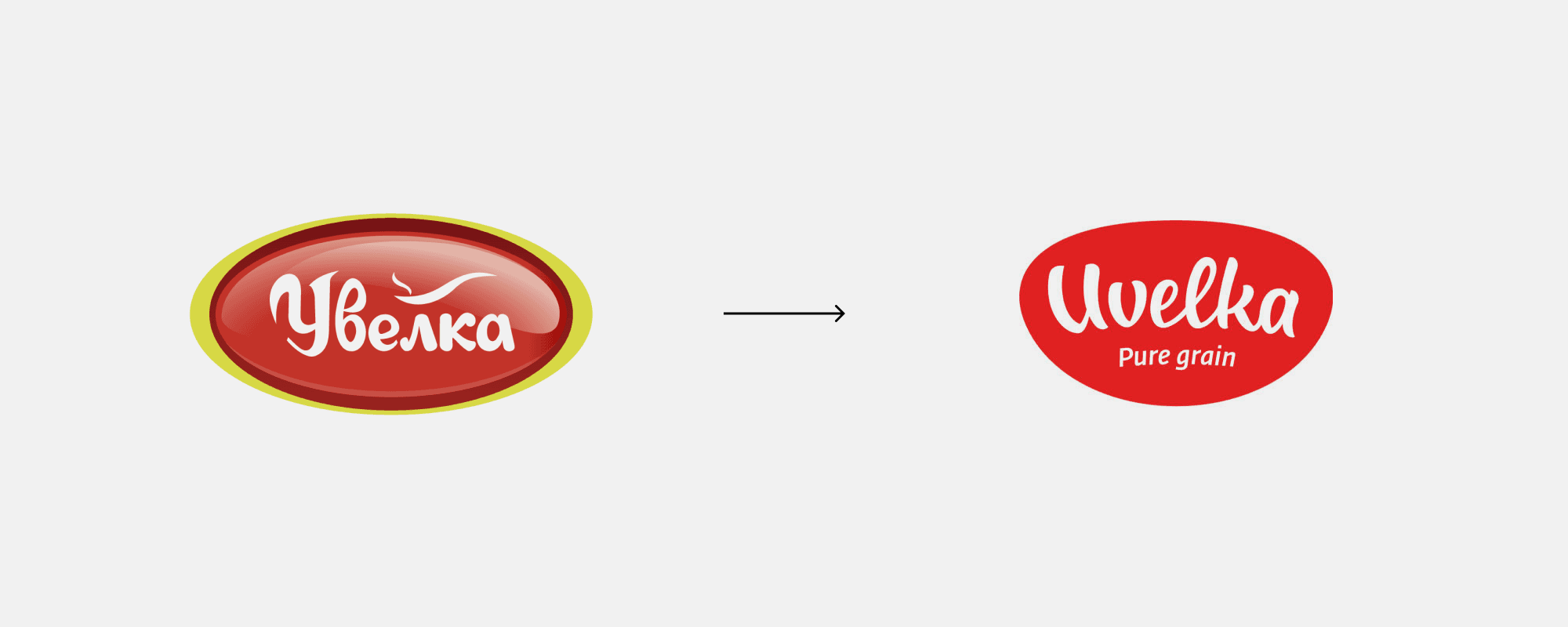
As part of the new brand positioning, Uvelka needed a new logo that would correspond to the updated brand platform, as well as a new visual identity and a flexible packaging system across multiple product lines.
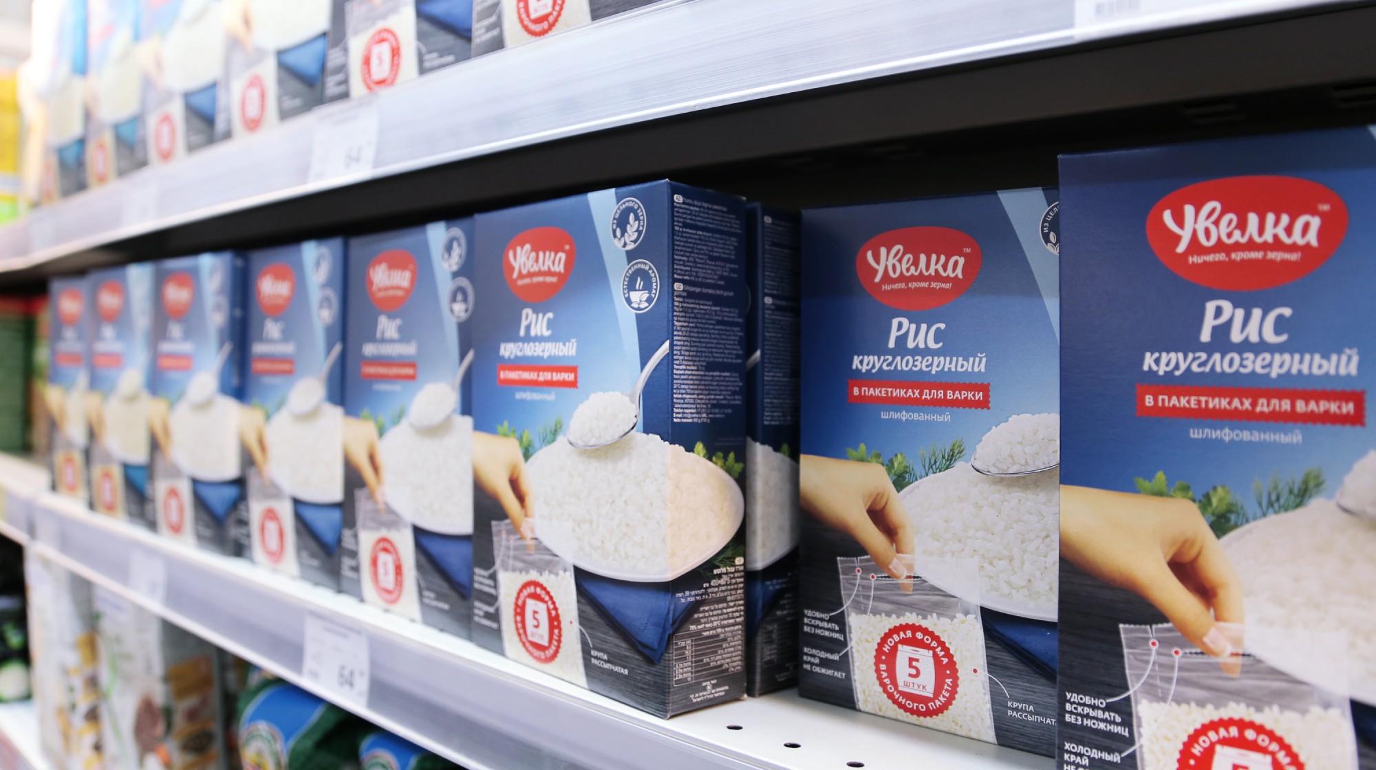
The main challenge in packaging was to create a unified design approach that would be bright, recognizable, and highly functional in a retail environment. It had to clearly differentiate product lines and individual SKUs, help the brand “own the shelf,” and communicate the values and product benefits defined in the new brand platform.
How might we redesign two large FMCG product lines so that they feel unified as one brand, stand out on shelf, remain flexible for differentiation, and convey the brand platform and values?

Work
Tender and concept development
The project began with a competitive tender. For BBDO Branding, this was one of the agency’s first major FMCG packaging tenders, as the agency had previously focused more on corporate branding.
The tender task was to develop a new logo concept and two packaging concepts for the lead SKUs in each line: buckwheat in cooking bags for the grains line, and five-minute oat flakes for the breakfast line.
Several leading Moscow FMCG branding agencies participated in the tender. At BBDO, two teams worked on the proposal, and I led the packaging work. As a result of the tender, BBDO won the contract to develop the new logo, visual identity, and packaging design system for the two product lines.

Building the packaging system
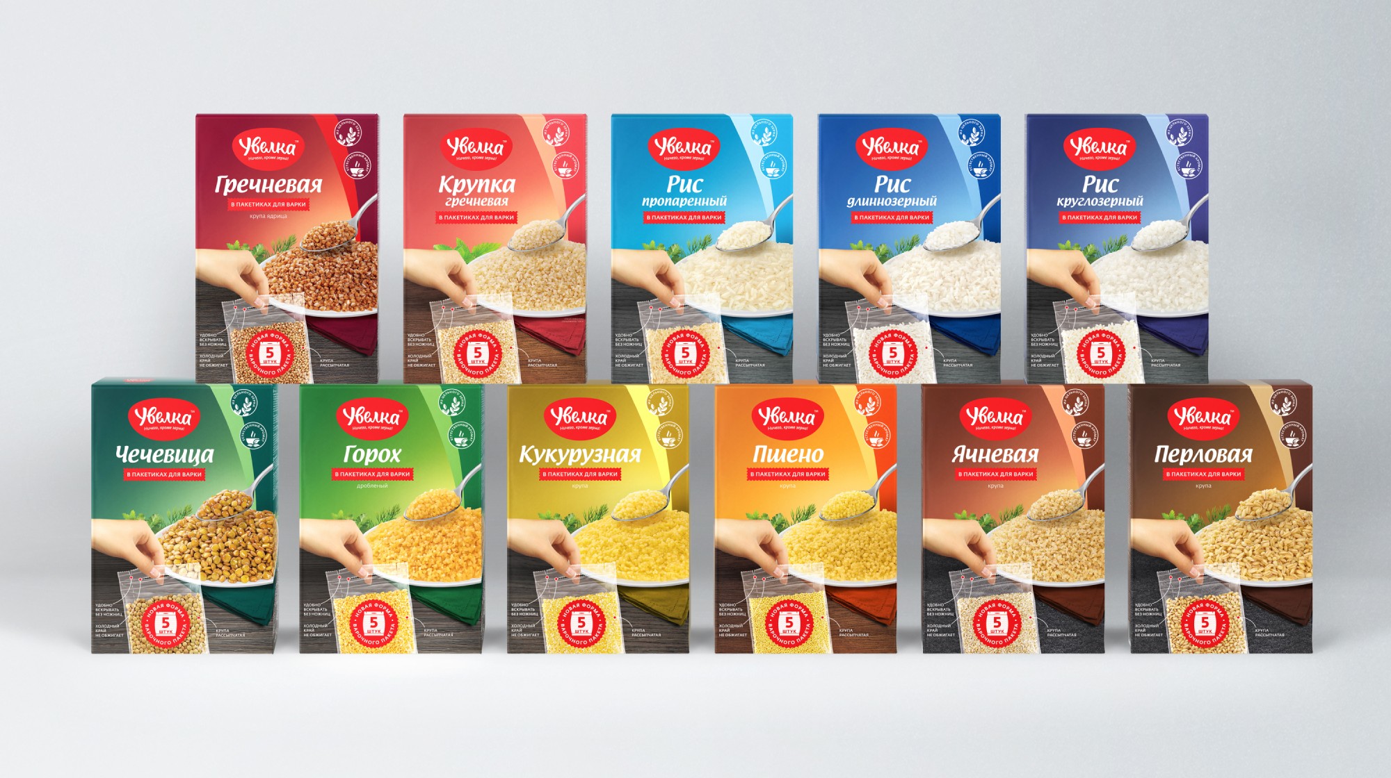
The final design had to work not as a single attractive package, but as a scalable system. We needed to create visual rules that could support dozens of SKUs while keeping the brand recognizable from a distance.
The system was built around three priorities:
Shelf impact
The packaging needed to create a strong, colorful block in retail and make Uvelka easy to notice among competitors.
Navigation
Consumers had to quickly understand the product line, grain type, cooking format, and preparation time. Color, typography, product photography, and iconography were used as a hierarchy rather than decoration.
Brand meaning
The design had to express the updated brand positioning: convenience, reliability, warmth, everyday usefulness, and a positive emotional connection with food.


Testing and iteration
The packaging work was developed together with the neuromarketing agency and went through several rounds of consumer testing.
The research combined qualitative interviews and focus groups with more technology-driven methods, including eye-tracking and EEG-based emotional-response testing. Eye-tracking helped us understand how shoppers read the package: what they noticed first, in what sequence they moved through the information, and whether the key product benefits were visible enough.
In parallel, participants were tested with EEG electrode caps that measured brain activity while they looked at the packaging. This made it possible to compare the emotional response to the new design with reactions to competitors’ packaging, and to evaluate whether the design created the intended level of attention, clarity, and positive engagement.
The final surveys tested whether consumers understood the intended brand values and product benefits from the packaging alone. This helped us refine the visual hierarchy, color coding, typography, and benefit communication before final production.


Results
The project helped BBDO Branding win a major FMCG packaging tender and delivered a packaging system validated by consumer research: 80% overall evaluation and 90% understanding of the new brand positioning.
01
BBDO Branding won its first major FMCG packaging tender and delivered a full packaging redesign for two of Uvelka’s key product lines.
02
The new system created a brighter, more unified, and more navigable shelf presence for the brand.
According to internal research, the design received an overall evaluation above 80%. More than 80% of respondents recognized the key brand drivers, and more than 90% understood the updated brand positioning from the packaging.

